
What of the
arrangements and choice of objects in a space? In a painting?
There is often an
interplay between symbols, creating mechanisms and dynamics which could simply
be suggestive and emotive for subjective reading, or specifically rooted in a
political or social stance.
A hierarchy, a
leadership?
An effort against or
for something? A push or pull.
A symbiosis?
The strong shape of a
trio?
A knife edge?
What is at stake in
this dynamic?
Does something carry a
burden for others or is there distribution?
IS there a collapse?
Is there activity?
I don’t ever want
there to be viewer passivity. Unless passivity is being rubbed in their face so
as to rouse them out of it.
Is there a person
present who we all know represents something? Is Grimes dancing on a Tokyo lilly pad
or is Bruce Springsteen driving out of town or is General Custer’s body stuffed
inside a bass drum or is Owen Patterson eating low welfare beef in
a Luxembourg restaurant?
A layering – what’s in
the background. ‘It’s a way of rhythm,
it’s a way of telling a story or a
situation or something like that’ -
Jo Baer
Are ideas mobilised
across thresholds? Pushed across them an into action as they depart from one
scene and enter another?
Hopefully I can begin
to mobilise, instead of simply romanticise. Or is loaded romanticism enough to
cooerce peoples leanings when minds are subjective anyway?
That’s another thing –
leanings. What props up what and what sways towards what?
Visibility is a
feature which can denominate the reading of a scene and so suggest a hierarchy
or dynamic. Visibility relies on many visual features:
Colour, size, shape,
texture, light, shadow, perspective, lines of sight, blocking, framing,
movement, stillness, spaces, pathways, proportion, balances etc.
‘You have to work to find out if your ideas are
any good’
…trying to turn a graphic into a painting…
real paintings have real structures that go
back a long way, all the way to the caves… there’s something that makes it
living, and if it’s not living throw it away’
‘I have an absolutely star unconscious, it does
what it wants to do, it pulls me along’
-
Jo Baer
There’s gotta be life
in the execution of the design.
And moving onto design…
message…. communication.
Design is a concept of
function and practicality. The function is communication. So the design is as
important as the life of a painting.
Perhaps poetry can
show the design of the ‘life’?
Alice Khalilova is a contemporary artist that I am very intrigued by.
However, she said ‘it’s almost a sin to use art like
propaganda – it didn’t lead anyone anywhere good’.
I cannot handle that
approach – I think that the world is on a knife edge socially and
environmentally, so all that we really have space for is art that leans towards
propaganda –that holds important, cohesive and accessible messages about what
to do to help. We no longer have the luxury of time or space that we can fill
with simply pretty things. They have to be more than that now.


 |
| collage in progress |
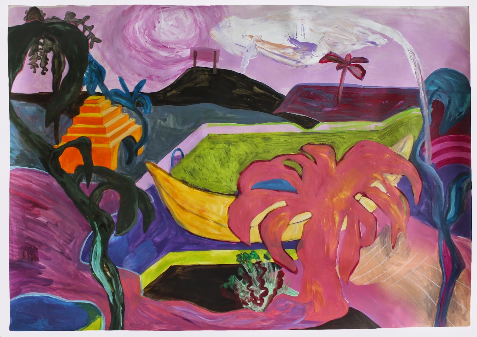


Above is a completed painting on algae paper. It is called 'Swaglands I'.
I like it. It's for sale in return for a van in which I can live. Or for the price thereof... maybe £150 to get me going.
Below are some screenshots of two places (Bongaree, QLD, Australia. and Long Beach, California) i'm desperate to go. I've been compiling a book of such places, including places I want return to again, and I am acquiring beautiful postcards of those places as part of a banner i'm working on about joining a narrative and appropriating other peoples adventures and dreams for our own emotional and ambitious development... vicarious living into real dream pursuit.
I wrote a bit about postcards a while back: http://battle-sponge.blogspot.co.uk/2014/12/postcard-perfect.html


No comments:
Post a Comment