

Above are some of the notes and scribblings I made in some of my 2014 notebooks. I like them. They all conjour up really strong images in my head of freshness, rejuvination and devotion to effort.
And below... Is recent stuff i've been up to in the studio, with a wee explanation beneath in the form of my notebook scans.
I've started to try painting. I've been terrified of painting for years because it seems to be this revered and distinguished club of artistry, that is so aloof and ungraspable... almost because it's the most obvious medium... it's the first conscious art we do as kids... and now the critics and high-art pros have tried to raise it to some unattainable level. Paintings seem to be read into far more than the artist ever intended, which is fine. But it'd be good to just be able to attribute the intention of a painting to wanting to realise something important in your head.
Some painters that I love are in a sense illustrators too. They do representational paintings, loaded with pictoral references and signifiers. They seem to exist within a context outside that of just critical art... which I much prefer than art which is only preoccupied with itself. So a few painters I really love for this reason are: Peter Doig, Hernan Bas, Elizabeth Peyton, Lauren Cohen, Marlene Dumas and Felice Zhukov.


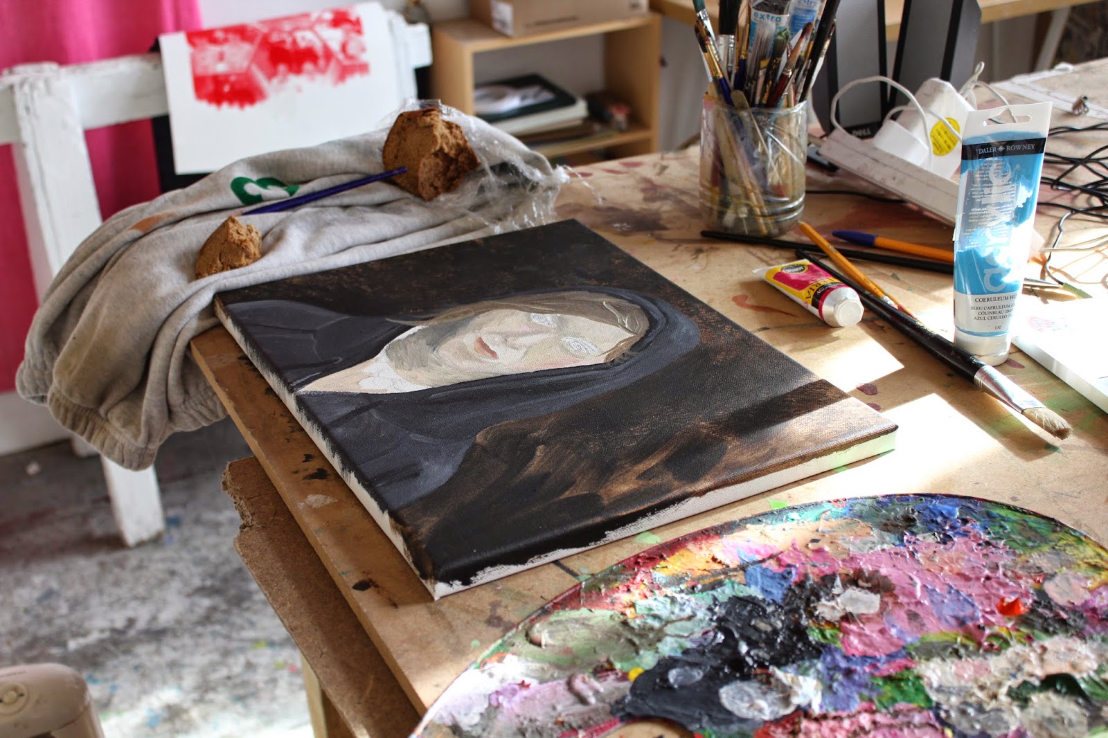 |
| A girl in a black hoody and a silk neck scarf, standing possibly in front of a dinosaur - up close so the scales fill the frame: A small image. An member of the audience at the Outback Cinema in the Swaglands. Finally here. based on RCA 2014 Sculpture grad Katrin Hanusch - she just doesn't look like what I expected. I ought to know this by now! The RCA website belittled me a but much, and her artist profile photo on there reminded me of me, and me wanting to be a cowgirl in the Outback. Not sure why. But a relief!   |
 |
| artwork by my small friend Remi, which looks like my painting above. |


 |
| Serious Bay-style flirting from Ricky and Brax |
 |
| Elizabeth Peyton in a great colour combination |
More scrawlings on how I want to materialise the Swaglands into being....
I had a lot of colourful thoughts today, literally. I was at the Marlene Dumas show at the Tate Modern this morning, and it's colours and painty marks seeped into my brain so effectively and I got obsessed and can't stop think about colours and how they mobilise meaning (she said something to this effect) and how they locate you geographically and emotionally in an instant (i say this). I forget why i'm drawn to certain colour combinations, and why I also distrust certain tones and certain colour combinations in some contexts. The wrong colour or tone combination with a certain subject matter/topic could go so wrong: like if you end up using cheap A4 pastel photo-copy paper to talk about racial issues... Or something like that.
So i need to consider my colour choices more carefully.


 |
| pink studio |
No comments:
Post a Comment